
Clann Credo
Community Finance Lender
Challenge
Rooted, But Showing Its Age
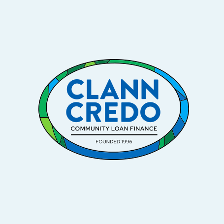
Clann Credo had spent nearly thirty years financing community ambition across Ireland. The identity carrying that work had not kept pace: an oval crest, a founding date and the words Community Loan Finance read like a formal lender rather than the supportive partner communities actually deal with.
The brand had to hold both things at once — the credibility of a serious social finance provider and the warmth of an organisation that answers the phone. It also had to work as hard on a pull-up banner at a community hall as it does on a loan agreement.
Solution
Spirited Empowerment
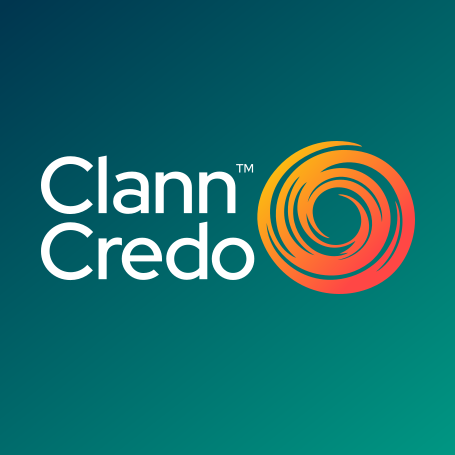
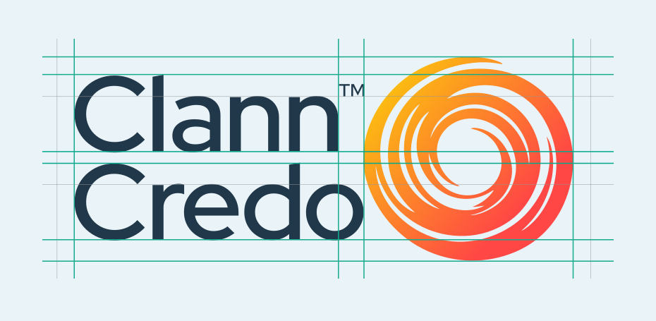
The new brandmark keeps the full Clann Credo name and sets it against a swirl that reads as partnership, momentum and shared direction — Clann Credo working alongside communities, funders and stakeholders to move an idea forward. A rounder, softer typeface brings warmth and openness, while the simplified single-colour wordmark protects the name at every size.
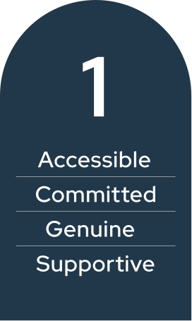
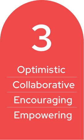
The palette moved to four confident colours — Clann Blue for trust and solidarity, Clann Green for growth and insight, Clann Yellow for optimism and momentum, and Clann Red for energy — carried by three brand pillars that describe how the organisation behaves as much as how it looks.



Result
Ready For Every Touchpoint
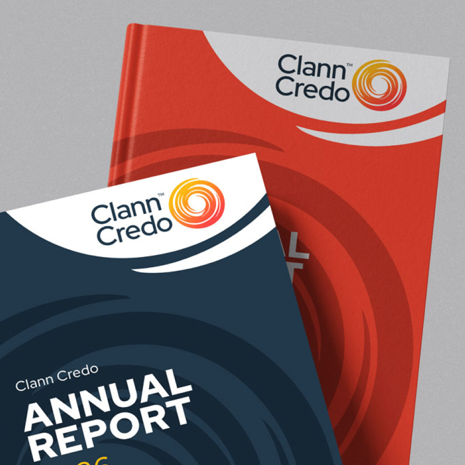
The brand shipped as a full guidelines document covering logo usage, colour, typography, overlays, photography direction and applications — so Clann Credo can produce on-brand work without coming back to us for every piece.
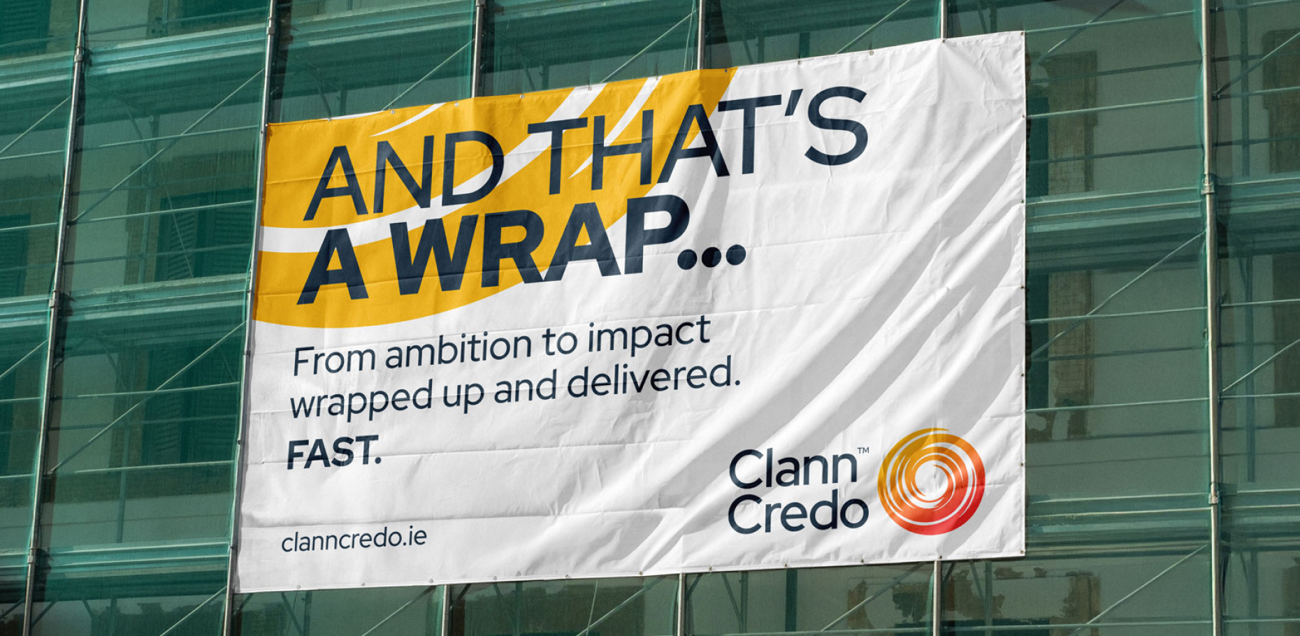
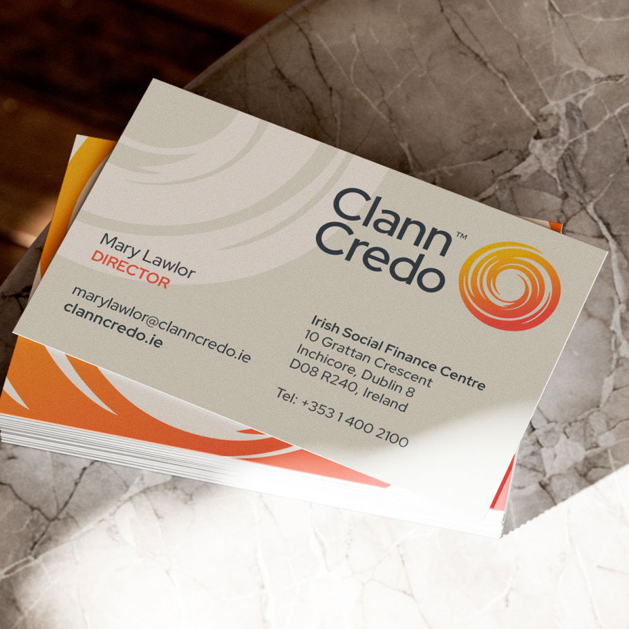
It now runs across a new website, corporate stationery, product literature, building wraps, merchandise and banners: one voice, one look, from a community hall to a city-centre hoarding.